
Smort
Smort – Artisanal Tartlets
Naming Strategy:
The name "Smort" derives from a linguistic exploration of the word "butter" (specifically inspired by the Danish smør or Yiddish shmorts roots). The phonetics of the word are short, memorable, and evoke a sense of richness and texture. By using a root from a language known for its high-quality dairy traditions, the brand immediately inherits a perception of premium craftsmanship and authentic flavor.
Visual Identity & Era (The 1940s Aesthetic):
The visual direction draws deep inspiration from the 1940s—a decade defined by the "Homecoming" era and the resurgence of domestic comfort.
Typography: The logo utilizes streamlined scripts or bold, rounded serifs typical of mid-century food packaging, conveying warmth and trustworthiness.
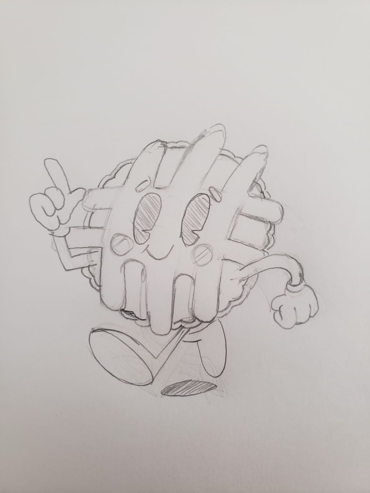
Symbolism: The tartlet icon is designed with clean, geometric lines, reflecting the transition from Art Deco to the more practical and friendly commercial art of the post-war period.
Color Palette: We suggest using "Butter Gold," "Creamy Ivory," and a "Vintage Navy" or "Burnt Sienna" to create a high-contrast, nostalgic feel that stands out on modern shelves while looking like a rediscovered classic.
Brand Promise:
The "Smort" identity bridges the gap between old-world European baking standards and the charming, optimistic graphic design of the 1940s. It tells the customer that this isn't just a dessert; it’s a piece of culinary history made with the simplest, finest ingredient: pure butter.
Visual Identity & Era (The 1940s Aesthetic):
The visual direction draws deep inspiration from the 1940s—a decade defined by the "Homecoming" era and the resurgence of domestic comfort.
Typography: The logo utilizes streamlined scripts or bold, rounded serifs typical of mid-century food packaging, conveying warmth and trustworthiness.
Symbolism: The tartlet icon is designed with clean, geometric lines, reflecting the transition from Art Deco to the more practical and friendly commercial art of the post-war period.
Color Palette: We suggest using "Butter Gold," "Creamy Ivory," and a "Vintage Navy" or "Burnt Sienna" to create a high-contrast, nostalgic feel that stands out on modern shelves while looking like a rediscovered classic.
Brand Promise:
The "Smort" identity bridges the gap between old-world European baking standards and the charming, optimistic graphic design of the 1940s. It tells the customer that this isn't just a dessert; it’s a piece of culinary history made with the simplest, finest ingredient: pure butter.
Each project tells a different story — discover them all.